« New Open Office Release | Main | A Brief Thought on Wealth »
Bending Over Backwards to Try to Show Wage Stagnation
The media is really bending over backwards to find ways to twist earnings data for average Americans to try to make the point that real income for many folks has stagnated or dropped. They are doing this to support a two-pronged legislative strategy in the next Obama administration:
- Use the power of the government to further tilt the balance towards unions and against employers in wage negotiations (this strategy having worked out so well to create prosperity in the automobile and airline industries)
- Further modify the income and Social Security tax structures to make them even more regressive than they are today.
They are firing on all cylinders behind this strategy. They are even mobilizing the neo-Keynesians to make the pitch that the Great Depression and the current financial crisis were caused by a shift in wealth from laborers to the capital classes, and that the only way to prevent future crises and depressions is to, wait for it, increase the power of unions and institute more wealth redistribution (Example here, via Kevin Drum).
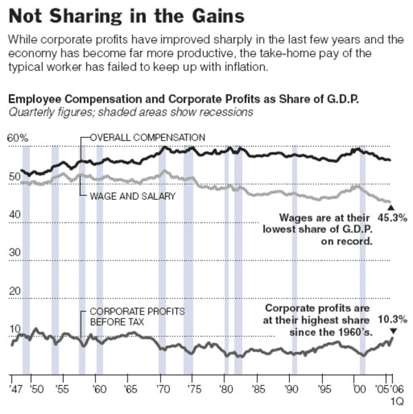
I was going to do a post fisking the James Livingston article linked above on Kevin Drum's site, but Livingston's hypothesis was such a mess that it was just going to take too much of my day. But in doing some research, I found this chart from a couple of years ago in the NY Times that really caught my attention:

Talk about chutzpuh -- look at the lede on the chart and then look at the chart itself. Yes, the lede is correct, but only if you choose the totally meaningless number of "cash wages" rather than total compensation. If one looks at total compensation (or what they call "overall" compensation), the entire argument falls apart. Workers have maintained about their same "share" of the economy.
Sure, a large percentage of that is now in health care benefits, but that's a choice workers have made (and the government has encouraged through tax policy). In fact, this compensation mix has been driven in large part by the Left's beloved unions, so on what basis can folks say that these other benefits somehow "don't count?" Certainly, they cost their employers equally, whether it is cash or health care. Corporate profits are up a bit, but in line with their normal historical levels in the 1950s and 1960s, the golden age of the US economy, according to the Left. (By the way, the pattern of falling wage shares and rising profit shares after recessions is a well-documented one. Wage-earners do best at the end of an economic cycle, employers more towards the beginning. The chart cut off after 1997 would look about the same as the last several years).
I will tell you right now that every time you hear someone bemoaning the stagnation of wages, they will never, ever, ever be talking about total compensation per individual. Having, through government policy and union activity pushed the compensation mix to non-cash elements, they then play a heads-I-win-tails-you-lose game of not giving any credit for those compensation elements.
Other games that are played to try to make the case that real earnings have stagnated include:
- Time frame selection. Everyone making this argument will choose 2000 as a starting point. They justify it by saying it is the beginning of the Bush years, but 2000 is really selected because it is a pre-recession peak, and they have to measure peak-to-trough of the economic cycle to try to make their point. Just as an example, if you look at the household income numbers below, you can see there is very typically a 5-year drop after a recession followed by net gains. If we chose, say, the first Clinton term we could play the same game, showing a peak-to-trough drop in real incomes.
- Household income game. The household income numbers are fraught with peril, because companies don't pay households, they pay individuals. And household makeups are changing simultaneous to income changes. For example, imagine the economy was just my household. If my wife were to get fed up with my shtick and divorce me tomorrow, average household income would drop by 50% in one day (as our total income stays the same but we go from one to two households). If my wife were to go back to her high-paying pre-kids job tomorrow (if only it were so!) our household income would go way up, in part because the labor department does not capture the value of the labor she provides at home.
Mark Perry has a lot more on the household income numbers here, but he shows that the household size number has been changing a lot, causing the metric to understate income changes per individual:
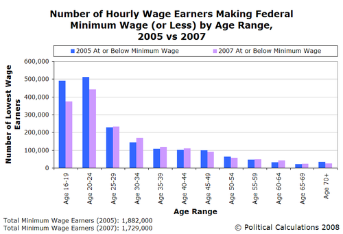
- Individuals matter. Median income looks at the middle person on the ranked list of US incomes. So, for example, if there are 100 million income earners, the median income is the income of number 50 million on this list. But whoever the person is at spot 50 million is almost certainly not the same person who was at spot 50 million last year. They might have fallen on the list, but the odds are they moved up. As folks age and gain experience and/or seniority, they tend to increase income faster than inflation. Most minimum wage earners, for example, tend to be under 25. The number of families supporting three kids on minimum wage (at least of the primary bread-winner) at the age of 45 is really, really low, despite the anecdotes we are bombarded with in the media.
- Immigration has a huge effect. The total number of foreign born people in the labor force is estimated around 21 million, of which perhaps 6.3 million are illegal immigrants. Positing that at least 10 million of these arrived in the last two decades, and that many of these folks began at relatively low, below-median incomes, means that median incomes are hugely affected by immigration. Leaving immigrants out so the comparison is close to apples and apples, to find the true median income gain over the last 20 years one would have to count up 10 million or so spots on the list.
Again, as in the previous point, most individuals can be better off even if the median stagnates (presumably immigrants coming in at the bottom are also better off, even at the bottom, than where they were before, or they would not have come. We often forget that much of our bottom quartile of income in this country would be upper middle class in many other nations). This is a classic mix problem that most people, and the media, almost always get wrong. In a situation with a changing mix of multiple groups, each of the groups can be improving on some metric, but the overall metric can go down. You can see the income stats by race here. Every race group has increasing median income, but since the Hispanic group has grown 8x faster than the anglo population in the US, the total results are mixed downwards.
Here is a quick example. Group A has values of 5,6,6,7. Group B has values of 1,2,3. Ten years later Group A is the same size and has values of 6,7,7,8. Group B has doubled in size, and now has values of 2,3,4,2,3,4. In these examples, every single individual has a higher value. Also, Group A's median has increased from 6 to 7, and Group B's has increased from 2 to 3. But the median for the whole combined group A+B has dropped from 5 to 4. Both medians (and averages) can do funny things when mix is shifting. - Even the NY Times. The NY Times actually makes two of these points for me in another article, arguing that historic median income drops were concentrated in areas of high immigration, and reported drops were due to the choice of the economic peak as a starting point. WOW? Is this the same NY Times I began this post criticizing. Yes it is, the only difference is that this article ran in 2001, when they were reporting on the economy during a Democratic administration.
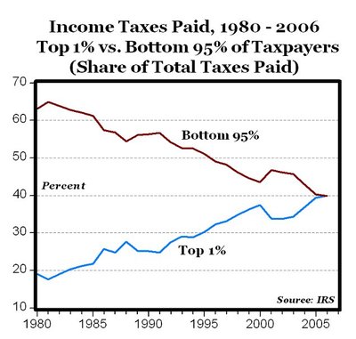
- Income taxes are already wildly progressive. While I would love to be in that top 1% group, I don't really begrudge them their success. Besides, who can look at the chart below, again from Mark Perry, and come to the conclusion that the top 1% are being treated unfairly generously.
- Every country that has implemented this plan (government-backed unions and wildly progressive tax policy), including most of Western Europe, is demonstrable worse off than the US on absolute measures. This is both the median, but also in every quintile, including the poorest. While it is true the poorest quintile has a bigger gap from the riches in the US vs. France for example, on an absolute basis our poorest are at least as well off (particularly when differences in immigration policy are taken into account).
Posted on October 19, 2008 at 02:04 PM | Permalink
Comments
This is one of your best posts. One other way to compare poor in USA vs. poor elsewhere is look what they have in terms of stuff and look at how much they weigh.
I read a census statistic that something ridiculous like 90% of households below the poverty line in the US have color TVs and DVD players. The appliance the USA poor have the least of? A dishwasher. Seriously. The poor in the US aren't doing so bad if they can swing a color TV and a DVD player.
And look at how much the poor in America weigh. Hell, look at how much Americans weigh, period. In the 1960's, people spent something like 25% of their disposable income just on food. Not so, today. Based on how much fat I see around the middles of even elementary school kids (and I'm fat, too...) food is cheap and plentiful in the good old USA.
Now, look at photos of the folks in Viet Nam, Africa, Afghanistan, Peru. If you spend (in Viet Nam, for example) 16 hours a day in the fields hoping to get enough to grow so your family can eat ... now that's poor.
Posted by: The other coyote | Oct 20, 2008 8:11:08 AM
One other comment. Everyone wants to complain about the cost of health insurance. 2 points: on the one hand, I say health care is expensive because we have the ability to keep a lot more people alive a lot longer than we used to - and all that costs money. Example: Bro-in-law's teenage son went into complete and total (and mysterious) liver failure last Xmas. He got a transplant and he's alive right now. 30 years ago, he would have died, and there was nothing anybody could have done about it. The bill was $250k plus. Those costs are spread around, but everybody's bill is higher when you don't just let people die.
Second point. I've noticed that plastic surgeons seem to have it figured out. Breast augmentation in Dallas runs around $5000. No health insurance, no government middle man, it's cash on the barrelhead (or credit card, or for a select few, I hear there is financing available). If a boob job costs $5k, why can't a routine appendectomy cost $5k?
Posted by: The other coyote | Oct 20, 2008 8:15:19 AM
"If a boob job costs $5k, why can't a routine appendectomy cost $5k?"
Because the vast majority of health care costs are fixed. You are not only paying for the variable costs of having the apependectomy, but the fact that the hospital and staff have been hired to work almost 24/7 to cover the probability you were going to have an appendectomy.
No matter what the politicians claim, the only way to reduce health care costs is to reduce fixed cost. That means fewer hospital beds, less staff, less technology, and less research and development. There is no other way to cut costs.
Posted by: Mark | Oct 20, 2008 9:15:52 AM
"If a boob job costs $5k, why can't a routine appendectomy cost $5k?"
Because the vast majority of health care costs are fixed. You are not only paying for the variable costs of having the apependectomy, but the fact that the hospital and staff have been hired to work almost 24/7 to cover the probability you were going to have an appendectomy.
No matter what the politicians claim, the only way to reduce health care costs is to reduce fixed cost. That means fewer hospital beds, less staff, less technology, and less research and development. There is no other way to cut costs.
Posted by: Mark | Oct 20, 2008 9:18:34 AM
One problem I see is we have no sense of the true cost of living. It may well be that if you take into account wages and other compensation like health care, that workers are keeping pace with their employers. but is it a decent living wage? Am I to assume that the working class who are the focus of both Presidential campaigns really aren't hurting and don't care about their economic state. This makes no sense to me. When the media interviews these people they express frustration about making ends meet, staying ahead and participating in the American dream. But I'm glad to see that our statistical charts make these complaints irrelevant.
And why is there an increasing discrepancy between CEO pay and the average worker? Does the consideration of CEO pay take into account the "other benefits" (health and otherwise) that owners of capital receive as compensation? Or do we discount other types of compensation when speaking of CEO's. I have no confidence that there would be an "apples to apples" comparison even if other compensation were included. After all, if you make enough money you may not need to worry about health care benefits or things of that sort since you have sufficient funds to buy a good policy or pay out of pocket. I don't know how you would make this comparable, and it is a value judgement to assume that workers and unions "choose health care benefits" over other compensation. What else might they do if they don't see a chance for a good raise and if they are seeing increasing costs for health care?
It's a nice academic argument, but it seems to ignore the messiness of real world compensation and negotiating influence. I'm all for good charts, but there is a self-serving aspect to this display of data. After all, the NYT and those who prefer their own charts, are both making value judgments about what the comparison should look like? What should it look like and why? What consequence, for economic growth and well-being follows from the correlation between worker compensation and CEO compensation? If they diverge too wildly is this bad for the economy, for workers or what? It is interesting to me that we assume it should look a certain way, but we can't explain why.
Posted by: Will | Oct 20, 2008 4:15:39 PM
Will - In the "messiness of the real world" those with below average incomes, spend more and have more than they used to. As for what CEO income counts, the post wasn't a comparison of CEO income to the income of others. The charts are 1 - wages, total compensation, and corporate profits as a percentage of GDP, 2 - median household income and average household size, 3 - people at or below minimum wage by age, 4 - percentage of total income tax revenue received from the those with the top 1% of income and those with the bottom 95%.
Posted by: Tim Fowler | Oct 21, 2008 2:39:04 PM
I assume Mark Perry's chart is only showing income tax, not the payroll tax. What would it look like with the payroll tax included, especially since those at the top would not pay the payroll tax on income above $97,000?
Posted by: WK | Oct 21, 2008 6:20:41 PM
No matter what the politicians claim, the only way to reduce health care costs is to reduce fixed cost. That means fewer hospital beds, less staff, less technology, and less research and development. There is no other way to cut costs.
"Less" technology would result in cost cutting in the American industry which has least experienced the efficiency gains of the IT revolution? I must be misunderstanding how productivity works..
There are almost unbelievable low hanging fruit in the health care IT field. If, for example, medical results were exchanged, printed, distributed and stored in a better format, the physical size of this data could be reduced by 75%. Why hasn't it been done?
Highly regulated, hence protected market. No need to be competitive. Big surprise we end up with super low productivity.
=darwin
Posted by: darwin | Oct 29, 2008 9:42:15 AM
I read a census statistic that something ridiculous like 90% of households below the poverty line in the US have color TVs and DVD players.
Posted by: drogen | Nov 8, 2008 3:13:56 AM
The comments to this entry are closed.


